

Project Overview
The customer approached us at a very early stage of product development, so our goal for the first stage was to prepare the product for alpha testing and gather early feedback. The project was split into a few phases, the first of which involved the following functionality:
Signing up with either their e-mail, Google or GitHub credentials;
Signing out;
Unsubscribing;
Acquiring phone numbers;
Adding/updating acquired mobile numbers;
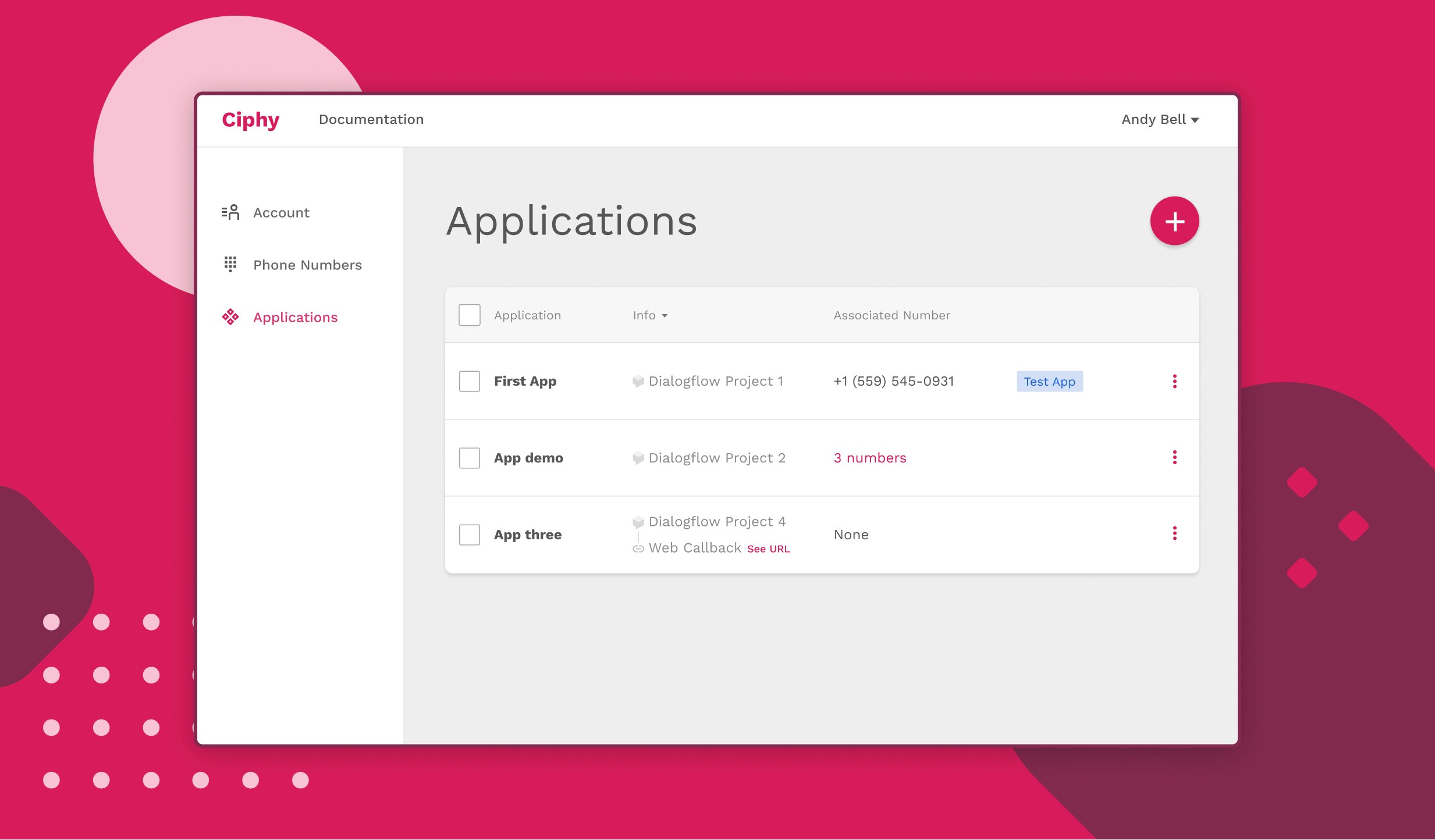
Viewing account details and acquired phone numbers;
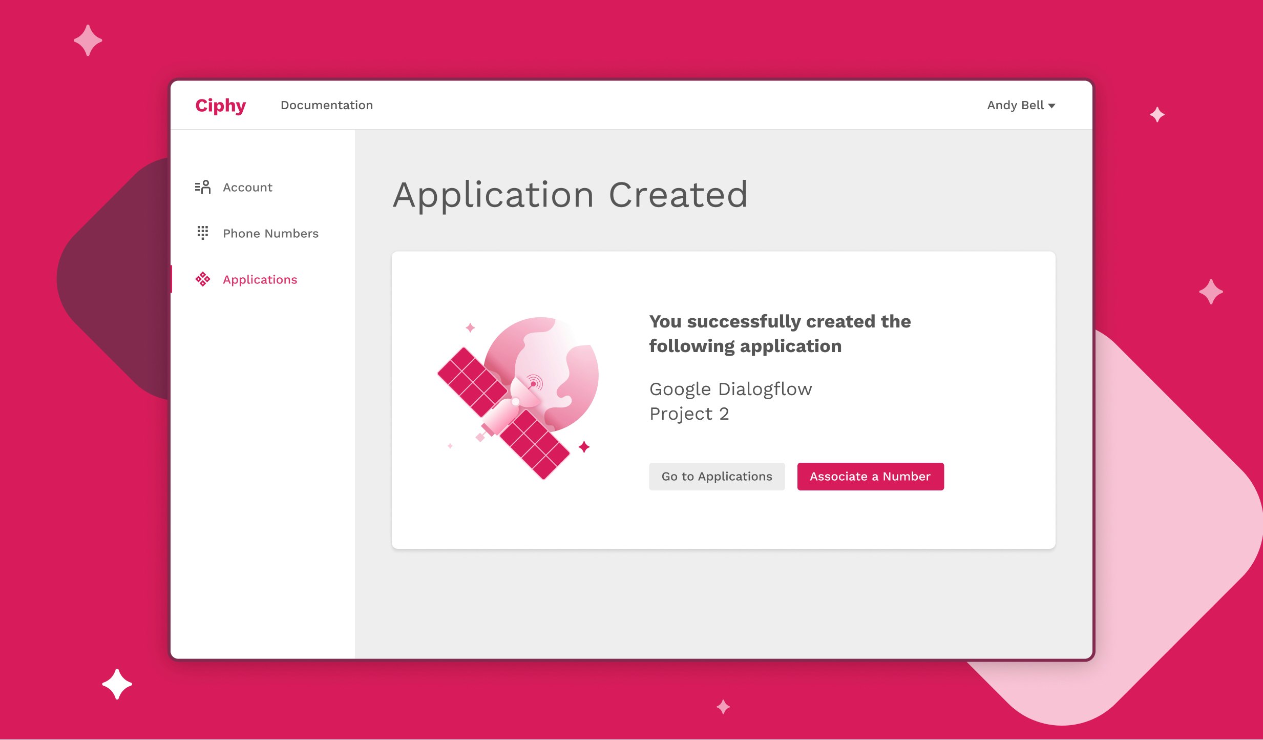
Creating an application;
Assigning a phone number to an application;
Viewing API reference.
The list of the aforementioned features was provided by the customer.
Design Process
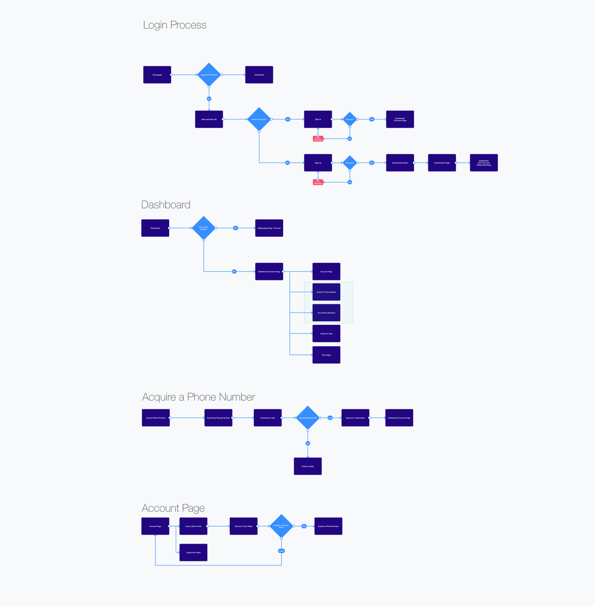
Mapping the User Flows
Having received the requirements for the first phase, the first thing we did is visualizing the functionality as a chart, so that we can map the user flow and see patterns. Based on these patterns, we were able to identify the optimal information architecture.


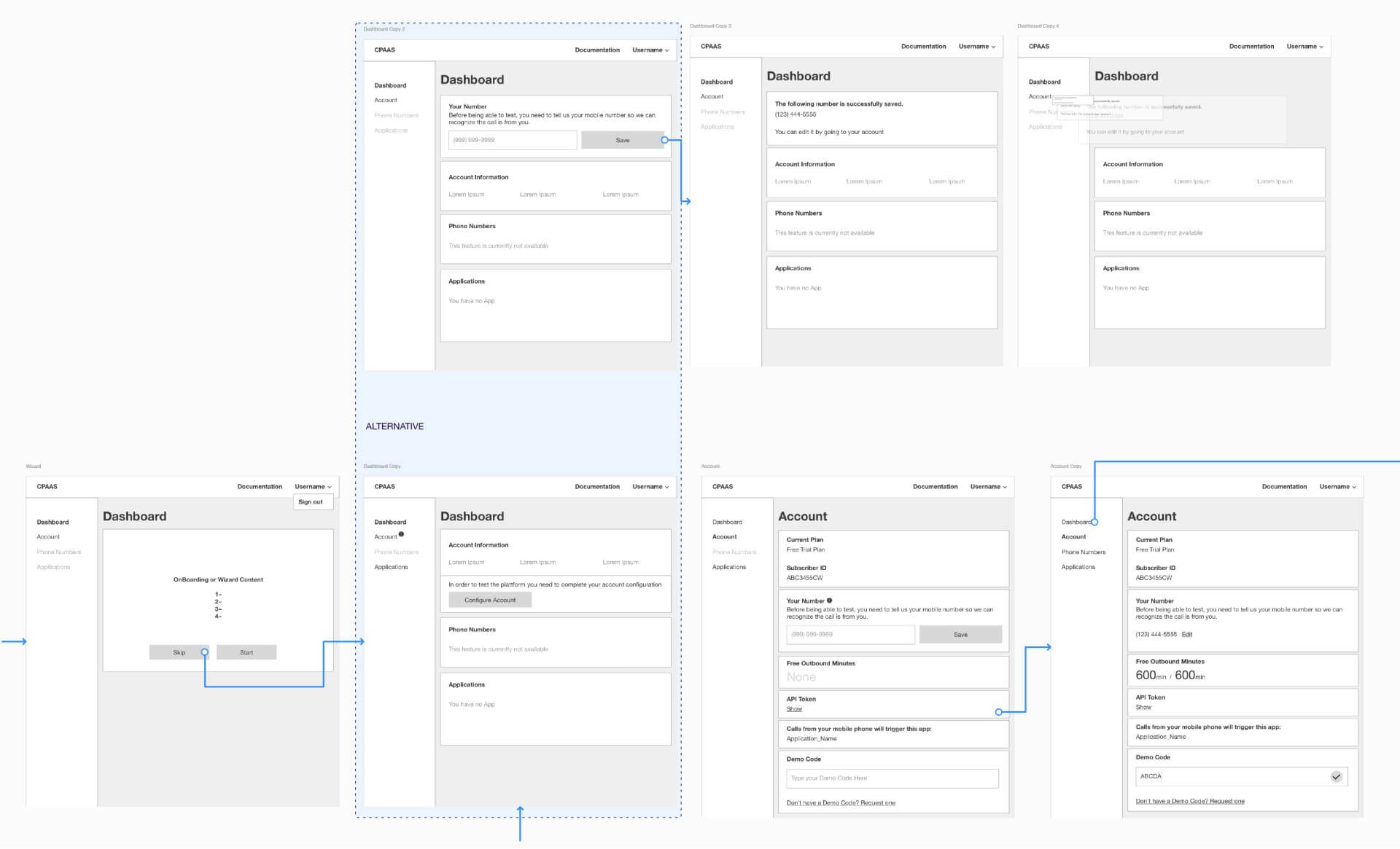
Preparing the low-fi wireframes
Having established the user flows, the next step was to turn features and flows into potential UI solutions. Based on the wireframes, we did the first round of usability testing, thereby identifying areas that were not clear enough for the end-users. As a result, we were able to modify the wireframes to better suit end-users’ needs.
Although the wireframes gave us a clear idea of information architecture and validated the logic behind the flow, they’re lifeless in terms of their look & feel, which brings us to the next stage.


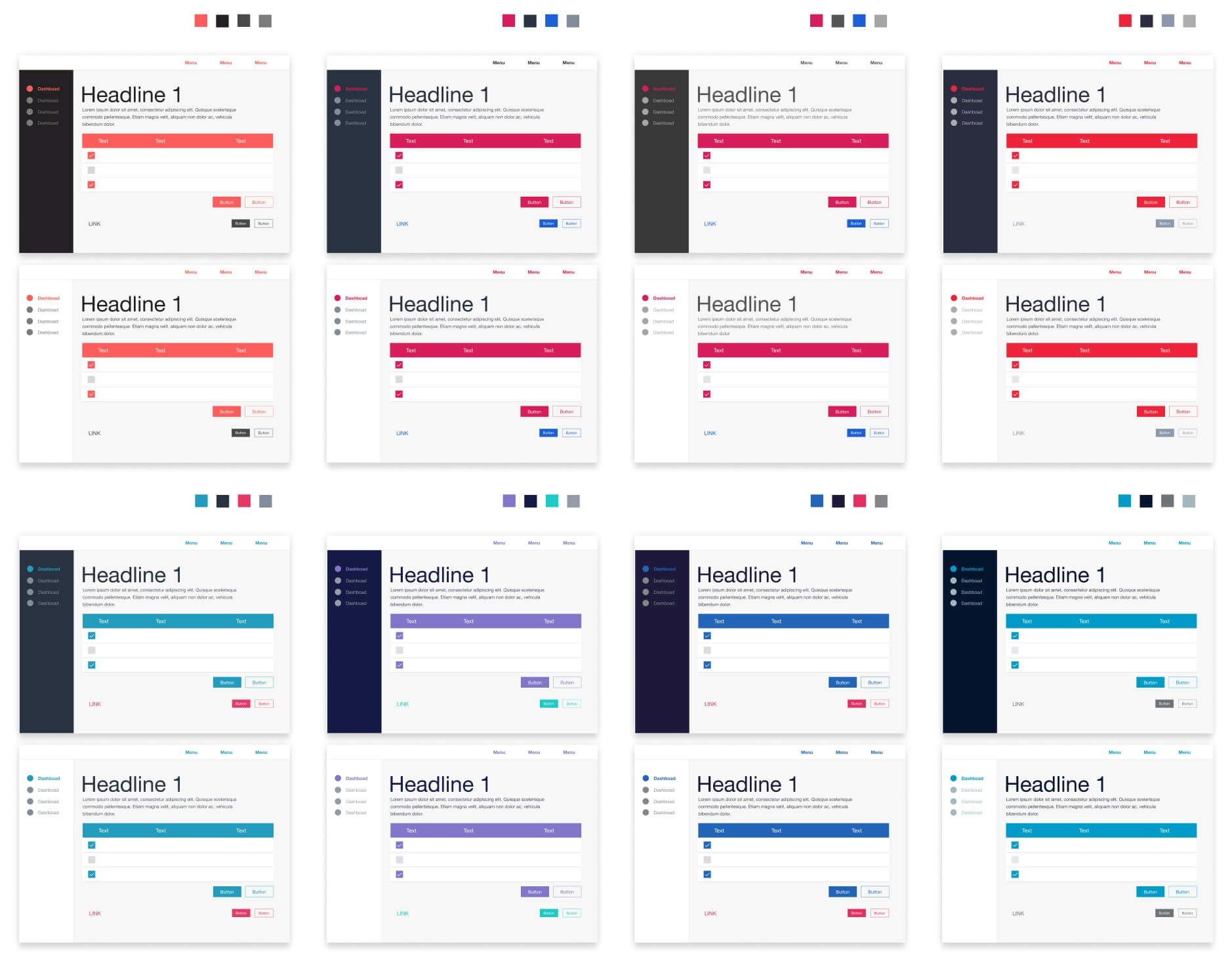
Compiling a moodboard
Moodboards are essentially a compilation of design references that help determine the look and feel that we were going for. Based on the moodboard and UI concepts we prepared, we were able to shortlist the styles that both conveyed the brand identity and delighted the end-users.


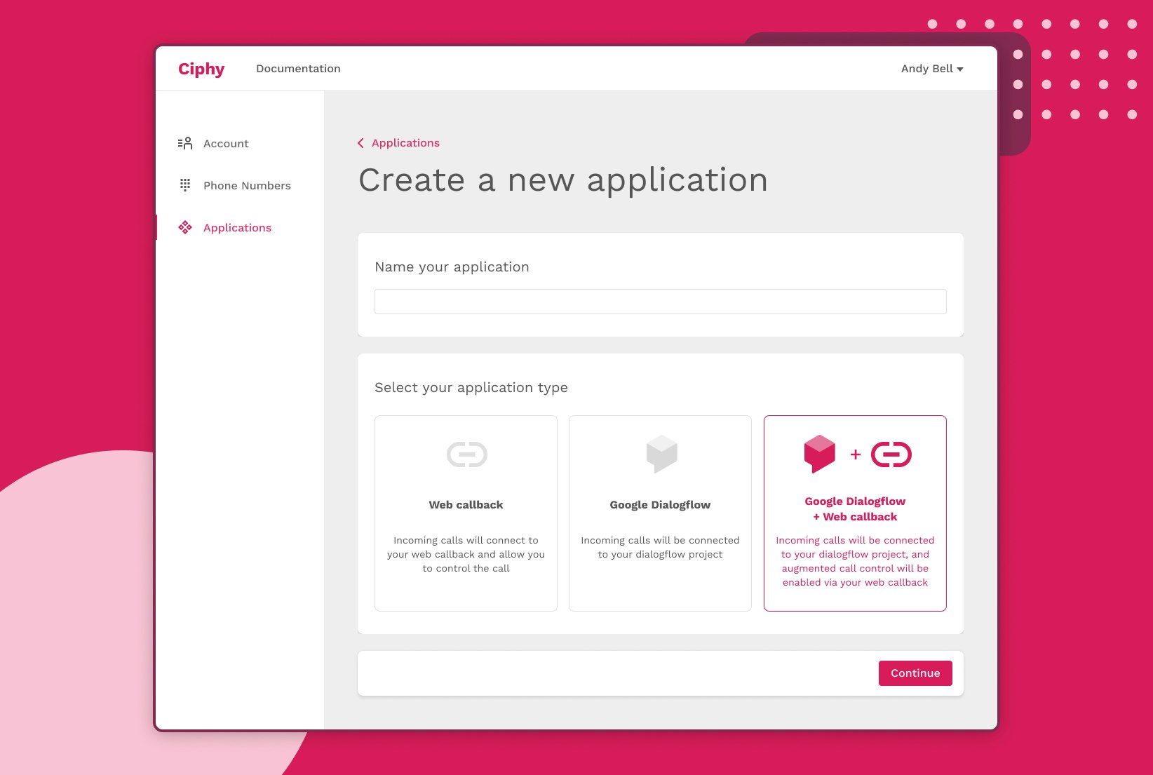
Designing the Interface
Having solidified our vision for the flow and the look of the app, the next stage was to design the actual high-fidelity interface. Since we followed the design process properly, it was pretty straight forward. This stage of product design also involved coming up with illustrations that not only delighted the users but also ensured better customer retention.


Prototyping & Usability testing
Although by this stage we had already completed the first round of usability testing, we decided to conduct the second round of usability testing to validate the final design for the first phase of the project.
Interactive Prototype created in Figma
Bottom line
As a result, of our cooperation with the client, we were able to turn a document with requirements into coding-ready validated design, which involved designing wireframes, prototyping, usability testing, and developing the visual identity.