


Try to think of a product you really enjoy using, a product that feels useful, intuitive, and well-designed. Why is it that you feel that way about it?
It’s often easy to pinpoint the things that we like about certain digital experiences, but achieving this sense of satisfaction relies on a massive combination of UX, visual, and Gestalt principles, along with a variety of laws that the user experience discipline has inherited from Human-Computer Interaction research and psychology.
In this article, we’ll explore a host of vital rules that every aspiring designer should learn and leverage.
Let’s dive right in.
Visual design principles
UX design has inherited its foundation from visual design principles. They’re vital when it comes to accentuating certain aspects of a UI, as well as achieving a sense of balance and aesthetic satisfaction.
Scale
Learning the principle of scale is one of the fundamental tenets of good visual design. It refers to using an object’s or element’s size to accentuate its importance within a particular composition.
Simply put, the essential parts of an interface should be larger compared to the less important ones. The logic behind this idea is fairly straightforward; the bigger something is, the easier it is to spot it. This way, we can help the people using a product to navigate it effectively.
However, a critical part of the scale principle is not to overload our users with too big of a variety of sizes in a design. The sweet spot UX designers should aim for is three different sizes. This way, users can quickly establish which elements are the largest (and therefore more important), without causing any unnecessary friction or cognitive overload.
Whenever you work on an interface that will be presented on different devices and, therefore, different screen sizes, it’s important to maintain the proportions of all the elements in regard to each other. This can be easily achieved when using rems—Root Ephemeral Units. By using rems as a measurement unit you’ll be able to keep a constant scale proportion between all the elements of your design.


Balance
The principle of balance revolves around a satisfying arrangement of elements within an interface. Designers can achieve a sense of balance when objects are proportionally distributed in a UI. It’s important to underline that balance, in this regard, doesn’t necessarily imply symmetry. Rather, it refers to an equal amount of elements on a vertical or horizontal axis.
A great mental model you can use when attempting to achieve balance in your design is an old-fashioned weight balance. It doesn’t really matter how many things you place on either side of the scale. It’s the weight that matters. So when applying this mental model to visual design, think of weight as the surface area that your elements take up on either side of the axis.
Balance, in a way, is similar to symmetry—it is an essential quality of the things we deem inherently beautiful. There’s a certain sense of satisfaction associated with seeing objects that are mirrored on one or more axes—human faces, butterflies, and so forth. Think of the last time you’ve been struck by the beauty of nature due to its proportion and symmetry. You can achieve the same by balancing out the elements in your design.


Hierarchy
Ensuring a clear visual hierarchy will help your users navigate an interface more efficiently.
Basically, your goal is to create an implied reference system for the importance of particular elements. There’s no tag or description associated with these elements, yet the people using your product should immediately understand which parts of your UI are central and which ones are secondary.
This can be done through a variety of visual parameters like color, placement, scale, and so forth.
Designers often leverage contrast to make elements appear heavier and more prominent in an interface. This typically provides these objects with an aura of importance, which enables users to deem them more valuable in a visual composition.


Contrast
Contrast is commonly used to accentuate certain parts of your design, allowing them to stand out.
The idea behind contrast is to juxtapose two elements that are different. This can be done through color, size, and a variety of other parameters.
Contrast is often used in systems to bring the user’s attention to an important action, especially ones that deal with deleting files. Apple’s mobile operating system, iOS, leverages contrast by using a red background for their “Delete” buttons. This is designed to make the user pay attention to the action they’re about to make and assess whether they have the intention to proceed with it.


Consistency
Consistency allows to connect separate design elements together and create a sense of continuity and cohesion. It helps the elements of your design to be part of a whole and “work” together.
This is essential when it comes to building an emotional relationship with the people who use your product. Their experience becomes more predictable and intuitive, which on its own provides them with a sense of security. Consistency also benefits designers by reducing the number of creative decisions they have to make.
Brands rely on consistency to leverage brand recognition and ease of use. A good example of such consistency is the way Adobe products design their UIs. If you’re accustomed to using Photoshop, you’ll find it much easier to transition towards their other products.


Principles of UX Design
UX design principles are a set of interdisciplinary laws and guidelines that stem from behavioral science, sociology, HCI, physics, and a variety of other areas.
Meeting users’ needs
This principle definitely sounds a tad self-explanatory. However, as UX designers become preoccupied with the more technical aspects of their craft, they often forget about this fundamental value of user experience.
Ensuring that our users’ needs are met relies on a wide array of practices that are key to UX, many of which we discuss in this article:
Leverage user research to get a better understanding of the people you’re designing for;
Create consistent design that will help them navigate your product comfortably;
Ensure a clear visual hierarchy;
Design with context in mind—always pay attention to the devices your users rely on to access your product, as well as the circumstances they use it in;
Create products that are malleable to ensure that users have more control over them. That is not to say that users should have full control. Rather, it’s about ensuring that your customers can access advanced features if they need to;
Usability testing is vital. Your work doesn’t stop once the product is released—ensuring optimal user experience revolves around an iterative process that aims to make continuous improvements and adjustments;
“You are not your user”
This principle derives from psychology, where it was coined as the false-consensus effect. This effect stems from psychologists’ observation that people have the tendency to assume that other people share their judgments and beliefs on a subject matter. UX designers are not exempt from this bias, either.
Since the discipline of UX design has to do with a wide array of assumptions about human behavior and user beliefs, designers, developers, and researchers need to be mindful not to fall into the trap of this cognitive distortion.
Fortunately, the solution to this issue is fairly straightforward—always assume that your users won’t share your opinion and, more importantly, test your assumptions with them. Don’t seek to validate your standpoint, instead focus on studying and investigating user behavior since your end goal is to satisfy their needs, not prove yourself right.
Usability first
Usability lies at the foundation of a good user experience. An eye-pleasing design can never replace an intuitive and easy-to-use interface that instills a sense of confidence and satisfaction. Therefore, it is imperative to ensure that your product is truly usable before you start worrying too much about aesthetics.
Usability testing will allow you to uncover the vast majority of issues that users may be confronted with while interacting with your product. However, given that UX prescribes an iterative design process, it’s essential to run usability testing as you iterate your designs. Consider testing before creating your first design, during prototyping, and when you’re ready to ship the product.
Nielsen’s ten usability heuristics
Around a quarter-century ago, Jakob Nielsen of the legendary Nielsen Norman Group developed ten usability heuristics that are meant to prescribe the standards for interaction design. Today, they are a set of fundamental commandments that all UX designers should know and apply to ensure that their interfaces are usable and accessible.
1. Visibility of system status
Evolution has programmed people to have a strong desire for control and understanding of their surroundings. This makes us feel safe and comfortable. To satisfy this need for security, designers should provide users with a clear understanding of the system status and provide feedback for every interaction a person has with an interface.
Imagine not understanding whether a page or element is loading or not. Imagine not knowing whether you’ve succeeded in clicking or tapping a button. This lack of understanding can create a strong sense of anxiety or dissatisfaction, which is objectively undesirable in the experience with a digital product.
A widely used example for system status visibility is the loading bar. Loading things onto a screen can take time, often more time than users expect. Not knowing whether something is actually loading can make people feel confused. Providing clear feedback alleviates this anxiety, ensuring that the system is responding and processing information.


2. Match between system and the real world
Interfaces are very novel to the human brain. While most interfaces have something in common, which allows us to have some anticipation regarding how to navigate them, every new UI is a challenge to us. To mitigate this, it’s important to create a sense of similarity between a system and the world we live in.
A great example of such a similarity is trash bins. We have them in every home and office, as well as in interfaces, like macOS or Windows, for instance. This is a very simple, yet brilliant way of creating a mental model for disposing of files and marking them as no longer necessary.


3. User control and freedom
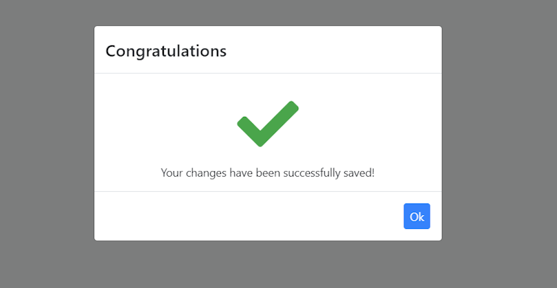
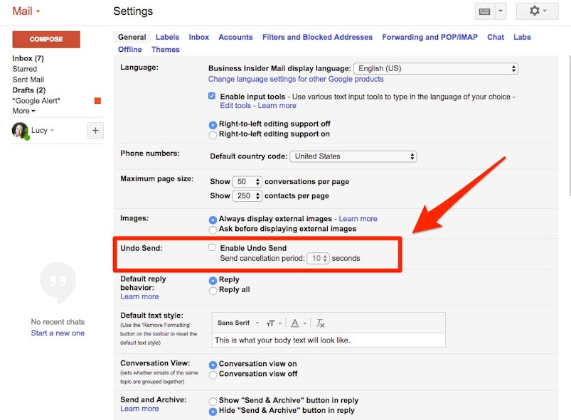
Nobody’s perfect. We all make mistakes. This is especially true when we interact with interfaces that are new or foreign to us. It is imperative that we, as designers, allow our users to make mistakes, but more importantly, diminish their cost by making them easily repairable.
One very straightforward way of doing so is providing users with the option to undo actions. Not only does this relieve users’ sense of anxiety, but it also provides them with a sense of confidence and curiosity.
Think of Whatsapp’s message deletion feature, Gmail’s unsend feature, or the feature that allows you to edit comments on your favorite social media sites. These are all excellent examples of this heuristic.


4. Consistency and standards
As we mentioned above, every interface is inherently new to us. One aspect of a UI that can induce additional friction or anxiety is language. When working with product copy, it’s essential to follow linguistic standards and conventions to help our users navigate the product effortlessly or, at the very least, not create extra confusion.
An excellent example of a large organization striving for consistent design and verbiage is none other than Google. The enterprise created Material Design, a visual guide that’s applicable to both their smartphone OS and all their web-based services.
5. Error prevention
Creating good error messages is an invaluable part of a good user experience. While it is best to ensure that users don’t run into issues altogether, notifying them about a problem that has occurred in a polite and informative manner is critical.
In UX design, there are two central types of errors: slips and mistakes. The former are typically made unintentionally. The latter, on the other hand, are caused by a user’s misunderstanding of the interface, which is fundamentally a design problem.
A neat way to prevent unintentional errors is to ask users whether they actually want to perform an action. However, there’s always space for improvement. A great example of such an improvement was created by Mailchimp—a North-American email marketing service.


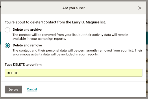
Instead of simply asking whether the user would like to delete a particular object or list, they ask them to confirm by typing in DELETE for confirmation and then pressing the Delete button.
6. Recognition rather than recall
Memory is an essential cognitive process that helps us navigate the world we live in, as well as the interfaces we interact with on a daily basis. However, memory is costly—it takes up a lot of our attention and overall “bandwidth,” making interfaces that rely on it pretty taxing.
A good design should strive to diminish the toll on a user’s memory and instead have elements that are easily recognizable.
One very simple way of diminishing memory load is providing users with their latest queries in the search bar. This way, they can quickly access the areas of your product or its contents in a swift and effortless manner.
7. Flexibility and efficiency of use
While a designer should always strive to make an interface intuitive and easy to use, there will always be a discrepancy between how knowledgeable and efficient some users are when in your product. A common feature that defines these discrepancies are shortcuts.
Providing users with the opportunity to use shortcuts will allow them to use an interface much more effectively. As a result, a design can cater to both seasoned users and people who have just started interacting with the product. More importantly, this allows users to personalize the use of a certain product, making it easier to navigate and benefit from it.
For instance Adobe XD provides users with the opportunity to set up quick shortcuts, which allows them to personalize their experience and have quick access to essential features without having to go to the main menu.
8. Aesthetic and minimalist design
Cluttered interfaces can seriously hinder user experience. As designers, we need to ensure that our products feature information and elements that are relevant to our users.
Failing to do so will only end up distracting our users and preventing them from navigating the product efficiently.
An iconic example of a no-nonsense, straight-to-the-point design is Google's homepage—two buttons and a search bar. What else do you need?
9. Help users recognize, diagnose, and recover from errors
As we’ve mentioned previously, designers should create experiences that minimize the probability of user error. However, if an error was made, how do we address it?
One of the fundamental aspects of a good error message is plain and straightforward language. It should both inform the user about the issue at hand and provide them with a quick solution to it.


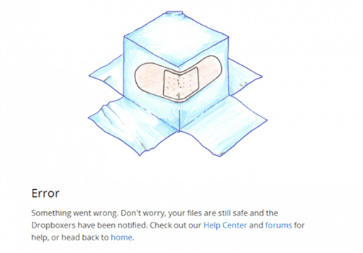
Bonus points: tell your users that everything is fine, just like Dropbox does in the example above.
10. Help and documentation
Ideally, a product should be intuitive enough so that it doesn’t demand any additional explanation and support. However, some products do need knowledge bases, especially if they’re tailored for specialized audiences or if they’re multifunctional and complex.
If your users end up needing support via documentation, it’s imperative to provide it in a concise and straightforward way. It’s best to ensure a sense of clarity in terms of the steps a user needs to take to achieve a particular goal.
Monday.com's documentation is a great example. Their docs are chock-full of images and bullet points, which makes it easy to scan and understand without investing too much time into reading.
Simplicity
One of the more interesting conundrums of UX design is that we have to ensure that our users have all the essential tools to perform a variety of complex tasks while also keeping things simple.
To ensure that our design is simple but not simplistic, we must always focus on understanding our users’ requirements and desires. Once we’ve understood the intricacies of their needs, it’s imperative to both find the shortest path towards executing a particular task and continuously test it with the actual users.
Gestalt Laws
Gestalt is a theory of visual perception that explains how humans process visual stimuli in the world that they live in. UX design’s interdisciplinary nature has long adopted Gestalt principles, which allow UX professionals to create designs that are more intuitive.
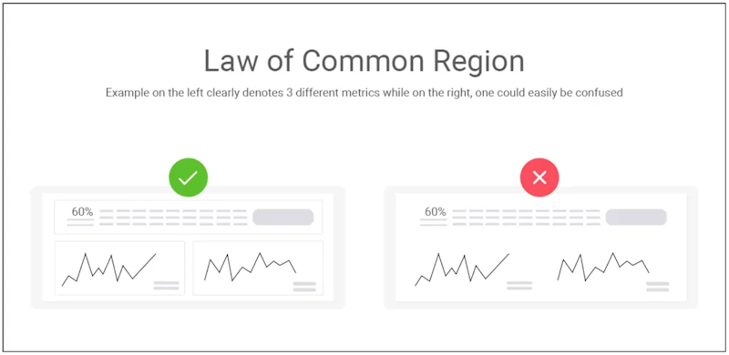
Common region
This principle revolves around the idea that a set of elements will be perceived as a group if they share a common boundary.
A good implementation of this principle is Pinterest’s way of displaying pins to its users.
Fundamentally, their pages are full of diverse images and texts. However, separating them with borders allows people to understand the boundaries of every particular pin, thus avoiding confusion.


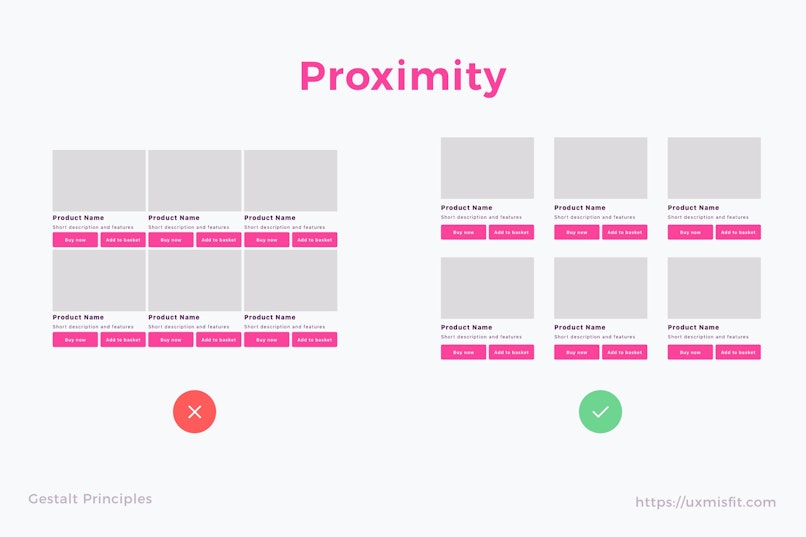
Proximity
Objects that are close to each other tend to be perceived as related.
Facebook users can leave reactions to comments, which are displayed in immediate proximity to the comment itself. This allows establishing what the reaction is to, which eliminates uncertainty and disorientation.


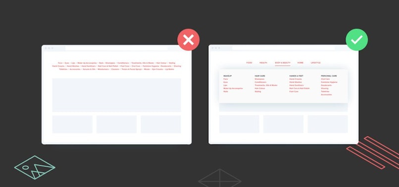
Similarity
We tend to perceive a series of similar objects as a whole, even if they are spread apart.
A great use of the similarity principle is Github’s section separation. It’s fairly easy to establish that the black section serves a different function as opposed to the blue section.


Uniform connectedness
Connected elements are perceived as more related, as opposed to the ones that are not.
There’s a good reason why articles use bullet points or other elements to list ideas or objects. Whenever we see a series of thoughts presented as a list with uniform bullets, we immediately assume that they are in a way related to one another.
Laws named after people
Jakob’s law
People spend a lot of time using sites. When creating one, it’s essential that your site works the same way as other sites.
This rule is essential due to the importance of pattern recognition in human-computer interaction. It allows us to process information and compare it to prior experiences to assist navigation.
For instance, think of headers. Most websites you’ll ever visit will have headers with a fairly predictable structure—a logo on the left-hand side, which will most probably be clickable. Also, by clicking it, you’ll be taken to the homepage. These canons allow us to use intefaces without having to focus on navigation too much.


Fitt’s law
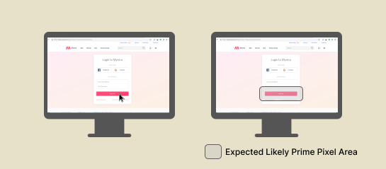
The farther away a target is and the smaller its size, the more difficult it is for the user to correctly land on that target. The main idea behind this law is that the amount of time required to click an element depends on its distance from the starting point of the cursor and the size of the element itself.
A common example of this law’s implementation is the design of interactive buttons—they are typically made larger, allowing users to access them quicker. Similarly, it’s common practice to keep them as close as possible to the user’s attention area.


Hick’s law
The amount of time it takes a user to make a decision is proportional to the number and complexity of the choices they have.
A common implementation of this law can be seen in drop-down items. Typically, UX designers tend to arrange the components in these items in a way that will allow users to reach their desired destination faster.


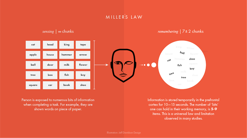
Miller’s law
Miller's law revolves around the idea that the approximate number of objects a regular person can hold in their working memory is seven.
It’s essential to underline that this law is commonly misused in UX, as it’s often a reason to impose unnecessary limitations onto a design.
This law is often used when informing users about date formats. Interfaces should aim to provide quick guidance on how users should input dates, like “MM.DD.YYYY,” for instance. This way, users have a clear understanding of the requirements without needing to invest too much cognitive effort.


Postel’s law
This law calls for a more liberal approach in regards to the type of input we accept from users and a conservative approach in what we send to the system. It calls for empathy, flexibility, and understanding for the types of actions a user may make within your system and that we should accept inputs that are formally incorrect and correct them when we process this data within our product.
Think of it this way, if your user fills in a form and leaves a space after their input—accept it, but make sure that your system eliminates the space. This law applies to a broad spectrum of inputs, like types, HTML tags—pretty much all data input that the user might provide you with.


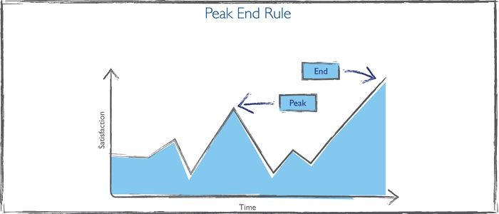
Peak-End Rule
This rule suggests that people will typically judge an experience based on how they felt at its peak and at its end instead of assessing the average quality of their experience. While it’s imperative for designers to ensure a superior user experience, it’s important to focus on the most intense points of a user's journey, as well as its very end.
Duolingo uses this rule to improve their users’ experience with their product by cheering and supporting them through their learning path.


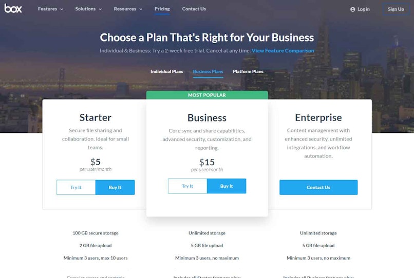
Von Restorff effect
The Von Restorff effect is also known as The Isolation Effect. It suggests that when users are exposed to multiple relatively similar objects, the one that differs from the rest is most likely to be remembered.
A common way to leverage the Von Restorff effect is to differentiate pricing tables for products and services. Typically, pricing tables are designed similarly. However, by making small changes in the design of one particular option, we can entice users to choose it.


Tesler’s law
This law suggests that there’s a certain amount of complexity to each system that cannot be reduced.
A classic example of Tesler’s law in practice is the auto-suggestion feature. Its goal is to make the search process a tad easier for users.
It displays potential search suggestions to reduce data input and help the user get immediate search results while they’re typing in their query.
Doherty Threshold
The Doherty threshold suggests that a person’s experience with a system improves dramatically whenever the feedback time drops below 400ms.
Think of the process of uploading a video to a platform like YouTube or Vimeo. You start by selecting the piece of media you’d like to publish on the platform and then continue to add descriptions, effects, and so forth. Typically, these platforms reduce the amount of time you’ll have to wait by actually uploading the video while you’re adding descriptions and selecting effects. As a result, when you’re done editing, the video will immediately be posted on the site because it has been uploaded in the background.
The bottom line
It’s essential not to become intimidated by these laws and their apparent complexity. If you analyze each of them in part, you’ll notice that most of them appear self-explanatory and almost evident.