

FinTech is growing like crazy. According to The Business Research Company, in 2018, the FinTech market was valued at ~$128 billion. By 2022, however, it’s expected to reach ~$310 billion. That’s a whopping 25% growth rate. This shouldn’t come as a surprise, that the number of products increases by the day.
Under the conditions of ever-increasing competition, FinTech startups can’t afford to make a mediocre product, let alone make crucial design and product mistakes. That’s what this article is about: ensuring that your fintech app avoids the pitfalls of mediocrity through impeccable UX.
Why trust our opinion? Throughout the years of our professional experience at Adam Fard Studio, we’ve designed plenty of FinTech apps. See more details here.
Let’s dive right in!
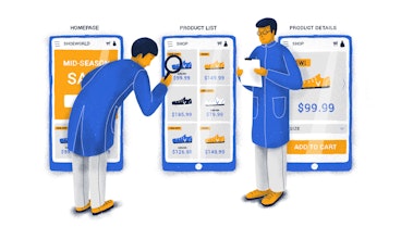
Too much functionality (more is less)
We’ll kick this list with a pitfall we see the most often. Trying to do too much.
It’s a product management truism that you’re better off doing something specific well, rather than doing everything in a mediocre way. A similar idea is applicable to design: less is more. Oftentimes people use a banking app just for moving their funds and keeping track of their expenses. If the said app is stuffed with a ton of other functionality you need to skim through before seeing the one feature you need, it’s likely to scare away users and confuse them.
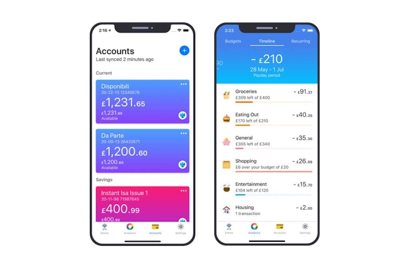
See the picture below. From a design standpoint, a budgeting mobile app Emma, shows just the essentials. The interface isn’t cluttered. From the product management point of view, Emma helps you budget and manage your spendings. No bells and whistles.


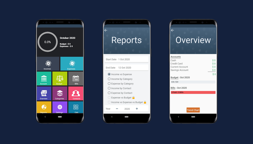
Here’s another budgeting app. Unlike Emma, it shows a lot of information right off the bat and provides so much customization that it gets confusing. While we’re sure that this app’s design team had users’ best interest at heart, it’s likely to backfire.


No personality
Simply doing what your app claims to do is not enough. It hasn’t been enough for a while by the way. The FinTech app market is increasingly more competitive, so being good at what you do is a lousy differentiator in most cases. That’s precisely the reason why you need to make the in- and out-of-app brand experience as enjoyable and memorable as possible. Develop a distinct tone of voice. Let your brand speak through the visuals. Quit treating your users as robots. All of the above apply to b2b too, by the way.
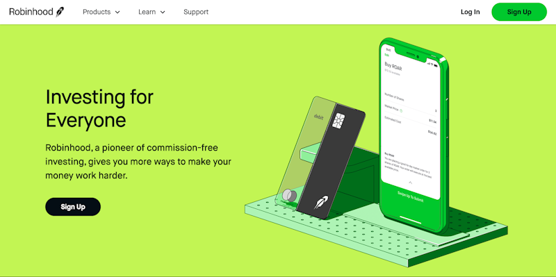
Here’s a great example of a brand personality. See how even the name itself conveys the idea behind the product. The distinct illustration style, the tone of voice, and the iconic green make it impossible to confuse Robinhood with anything else.


Confusing copy
The overwhelming majority of your users aren’t accountants (unless it’s an app for accountants), so make sure you treat your customers as such. That means no confusing financial jargon. Speak as if your users have next to none accounting knowledge. That’s especially relevant in b2c.
Take a look at Revolut’s landing page. The subheading tells you what the app does without using a single financial jargon.


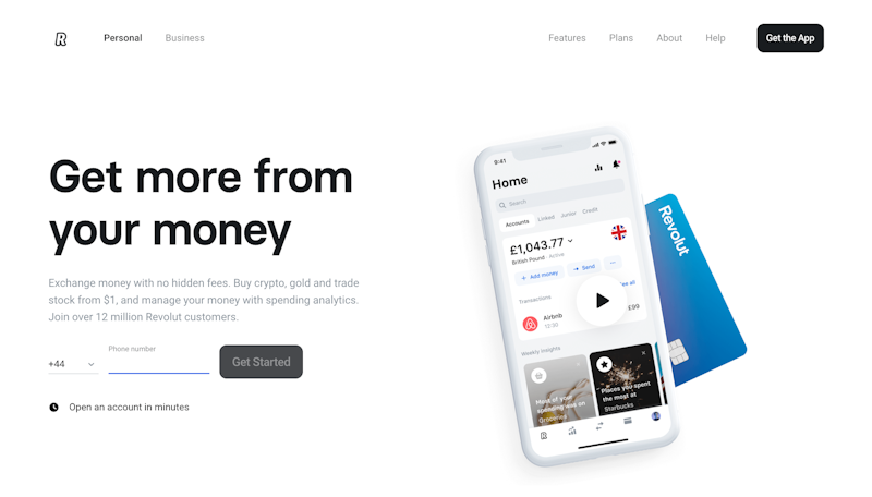
On the other hand, we have Flagship. Words like “processing”, “merchant” or “same day funding” are likely to be confusing. Notice how instead of “processing” the Revolut’s page mentions “exchange”, “buy”, “trade” and “manage” which are a lot easier to understand.


Made (not!) to stick
It’s pretty safe to say that people do transactions every day. You buy a coffee, cash out a paycheck, pay your vendor. All of these operations are reflected in the apps. As such, you need to encourage usage and make sure it’s smooth. That brings us to stickiness.
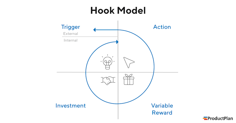
Stickiness is what makes people come back and “stick” to your app. Hook model and gamification are some of the ways you can do that. Hooks are basically creating triggers that stimulate actions. You can read more about that here.


Another great way to boost stickiness is gamification. See how Monobank (the picture below) utilizes achievements to encourage app usage. Another advantage of similar perks is that they are an invaluable differentiator. FinTech apps haven’t yet fully recognized the power of gamification. It’s about time they did.


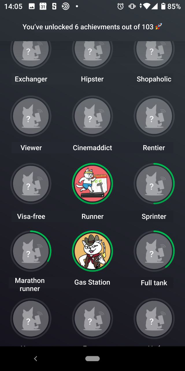
This section of the article was meant to show an app that doesn’t utilize gamification or other stickiness principles. There are so many apps that don’t do that, we could literally download a random app and it would fit the context perfectly.
Data rather than insights
Nowadays, it’s hard to find a fintech app that wouldn’t visualize data in some sort of way. Usually, these are bar or pie charts. However, the graph is as good as your interpretation of it. The latter has two implications:
you need to make sure the charts are crystal clear;
If the data or the chart are too complex, you need to generate insights based on the data, rather than displaying the data and hoping users will make their own conclusions.
Regarding the first implication. Pie charts, bar charts, and line charts are generally easy to read. These charts alone should do a good job of conveying the information. This brings us to the second implication.
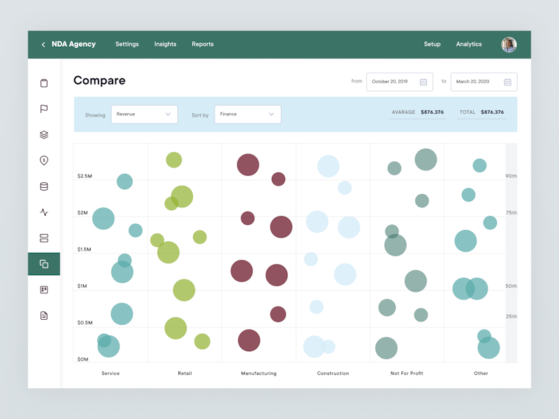
Using complex charts like scatter plots, trellis plots, and sunburst charts in fintech design, or any design for that matter, is ill-advised. Take a look at the design below. Unless it’s an app for data scientists, this chart isn’t helpful at the slightest. The last time most users have seen a scatter plot graph was during their college entrance exams. Therefore, it would make more sense to turn the data into insights.


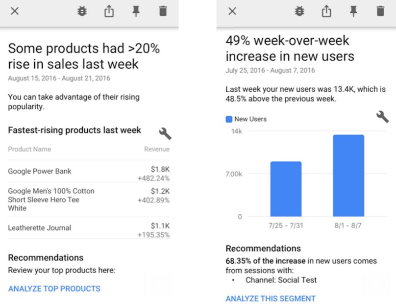
Take a look at the picture below. It’s a screenshot from Google Analytics. Although it’s not a fintech tool, it shows how products can turn graphs upon graphs of information into valuable insights.


Outro
If this article is going to be helpful in at least one way, we hope that it will help you, our beloved reader, to break your app free from the chains of mediocrity. Make sure to avoid the mistakes, we’ve mentioned and you should be on your way to creating a truly remarkable fintech product.