

In this article, we'll take a look at five important UX and UI challenges when creating a finance app and their solutions.
For most people, finances aren't a particularly exciting topic. They find managing their money to be nerve-wracking. This is one of the steepest hurdles that businesses need to overcome when creating a finance app.
Despite this disadvantage, many excellent products manage to bypass it. Their solutions lie in a creative approach toward user experience and UI design.
Get Your FinTech Design Project Done In Time and Within Budget.
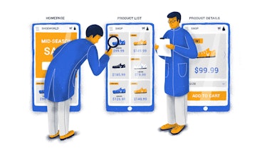
Challenge #1 — Don't overwhelm users
It takes very little to make things complicated when it comes to finances. In many cases, displaying too much data can cause the user to feel uncomfortable. Similarly, having too many features in your app can take a toll on the user’s cognitive load.
The medium in which these events take place is also significant. The fact that all this information is crammed in a relatively small screen doesn’t help you at all. All these factors pose a severe threat to your app's usability.
Recap:
It's essential to have an excellent onboarding process that doesn't have a steep learning curve.
We need to make sure that the app's information architecture is contextual. Context acts as a landmark for the user, helping them navigate your fintech app's features.
Challenge #2 — Don't bore users
Another critical problem that many financial apps have to deal with is boredom. Unfortunately, as humans, we aren't really into managing our expenses. But there are a few ways around this lack of interest.
To create a less bland Fintech app design, you need to bring more fun and joy into them. Nothing boosts motivation and confidence like positive reinforcement and clean design with a smooth flow. The idea is to counteract boredom with excitement about the future.
Here's how Twine, an app designed for savings and investments, utilizes their users' goals to get them excited.


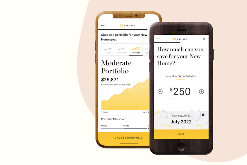
Source: twine.com
Now, they're more than just goals: They’re objectives. Users know exactly when they'll reach their goals, based on their savings plan or investment portfolio. The clean and intuitive design places the person's dreams above financial jargon and complex operations.
A pleasant color palette works wonders as well. N26's banking app is a notable example of minimalist, sleek, and functional design.


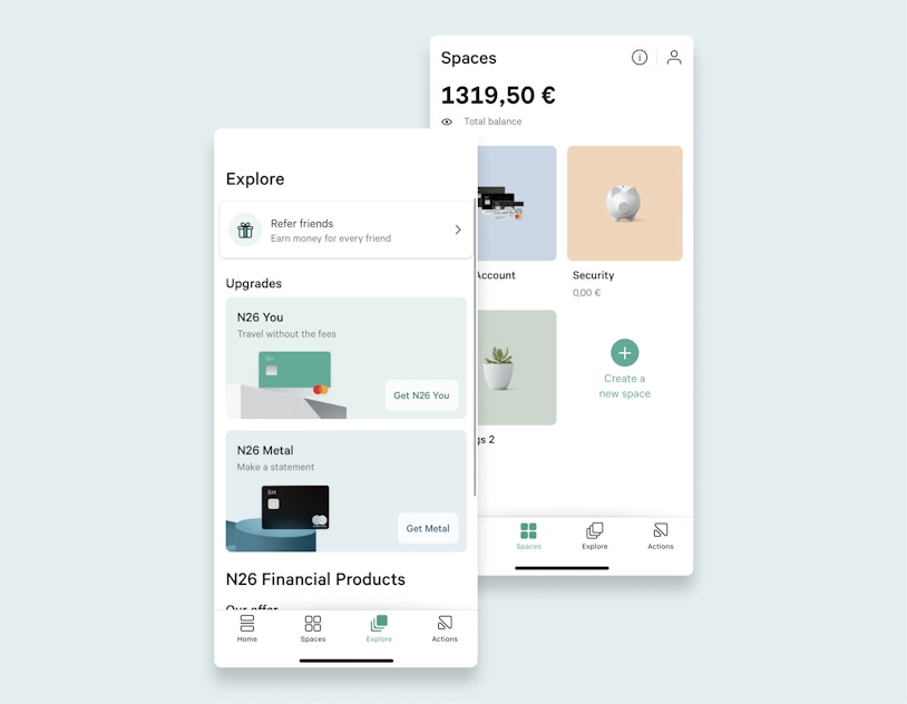
Source: n26.com
Besides being well-executed from a usability standpoint, the N26 app also features colors that don't strain the eye. They're light and appealing, adding to the pleasure of using the app.
Recap:
Help your users become excited about managing their money.
Add positive feedback to help them stay motivated.
Turn goals into quantifiable objectives.
Challenge #3 — Speak your users’ language
What makes Fintech tools complicated most of the time is their impenetrable language. Cash flow, financial statement, and gross profit are all terms that most people don't use daily, let alone know how to differentiate between them. Language is something that a financial app can't afford to disregard.
To ensure a seamless experience, a financial app needs to be understandable to everyone — novice or expert. To do that, it's crucial to create a suitable termbase that won't overwhelm users.
While this process may be strenuous on the UX team, it will have a massive impact on the app's adoption and retention. This is where UX research will help you identify the most suitable language for your app.
For instance, if most of your users aren't versed economists, consider opting for "billing" instead of "invoicing." This ensures that the users will know precisely what they're doing with their money without worrying about making a mistake.
When dealing with money, we need to take formatting norms into account as well. For instance, the U.K. and the U.S. use a period to separate decimals. Other countries use a comma. Failing to accommodate for these differences might result in unnecessary anxiety on the user’s part.
Recap:
Avoid jargon as much as possible.
Create a termbase suitable for experts and beginners.
Pay close attention to formatting standards.
Challenge #4 — Make users feel safe


Biometric identification has become the norm in Fintech. It is considered to be the new frontier of security, allowing users to authenticate quickly and effortlessly.
As a result, a growing number of apps have adopted this technology. But a report published by Emarketer found that while users do find it faster, they are concerned about the safety of their data. This insecurity, added to the general anxiety of making long-term financial decisions, turns into a real UX challenge.
The product team has to make the user feel safe. They need to be confident that their identity data won't be mishandled and is secure.
Here are a few ways that you can make your users feel safer:
Always explain why certain data is needed.
Make data collection as effortless as possible.
Provide them with positive feedback in the process.
Challenge #5 — Help users make sound decisions
Money is an instrument — a powerful one. We use money as a means to ensure our livelihood, but we are also prone to making irrational decisions.
The vast majority of financial apps are built to help users save money and make viable investments, among other objectives. But what’s often missing is a means to combat irrational behavior when it comes to money.
The app's design and copy should combine emotional feedback with hard data. If a decision they've made earned or saved them money — tell them about it. Make them feel proud. Help your user turn reasonable financial decisions into a habit.
A great example that made it into the press is the story of Benjamin Snyder, the leadership editor for CNBC. He wrote an insightful article about how he was able to save over $15,000 in three years. To accomplish this, he used MINT, a popular budgeting app.
According to Snyder, the app helped him really understand his spending habits. Now he has a clear understanding of how much he spends on food, utilities, and so forth, and this helps him make informed decisions. Knowing more helps him save more.
Without the app helping me visualize the growth of my personal net worth and understand when I need to cut back to pay off a big bill, I'd just be guessing. With it, I've been able to save $15,000.
Our apps should also nudge the user to make certain choices. People are much more likely to do something after repeated exposure to the idea. We need to think as if our users' choices are our responsibility.
Recap:
Help users make informed financial decisions instead of emotional ones.
The takeaway


Creating and designing a finance app is by no means an easy job. First, you need to thread a thin line between overwhelming your users and boring them. This alone is an arduous task.
Second, we must try to speak their language. Adapting the app's terminology will make the experience more pleasant and frictionless. Lastly, we need to help them make great decisions and make them feel safe in the process.