“Don’t make me think” is a renowned mantra in the world of design, coined by Steve Krug. It has served as a guiding principle in the world of design and UX for twenty years. It teaches us how to create great experiences in a straightforward and accessible manner.
In today’s article, we’d like to look into enterprise design and its peculiarities. It’s essential to underline that the very nature of enterprise UX slightly differs from consumer UX. As a result, some of Krug’s principles must be adjusted when designing enterprise software.
This article is by no means a refutation of the design principle. Please treat it as a mere asterisk with a fine print at the bottom.
Learning curves aren’t inherently bad
According to Krug, products that make people think also make people unhappy. Products with steep learning curves very rarely succeed in the modern business ecosystem. Customers will pretty much always choose the path of least resistance. This isn’t necessarily true of enterprise products.
Enterprise users are power users — and it’s imperative that we take this into account when designing products for them. They interact with niche software on a daily basis and quite possibly for many years. They know their way around the logic of the products they use.
Creating an interface that demands some learning results in a steeper learning curve isn’t inherently wrong. It allows users to work more efficiently once they’ve invested a certain amount of time into training and learning.
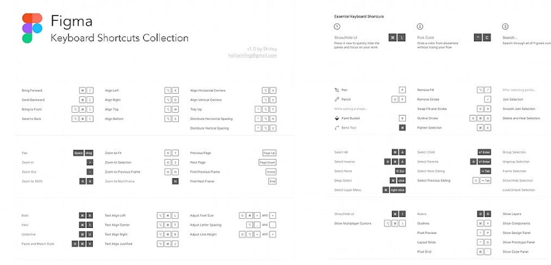
Take, for instance, products like Figma, Sketch, Adobe Pro, or any other professional software — most of them have a wide array of shortcuts. Features such as shortcuts may take a while to master, but they’ll ensure a significant boost in productivity once learned.
Simplify Enrerprise UX cautiously
We’re very well aware of the importance of keeping interfaces simple and obvious. However, it’s essential to keep in mind the complexity of the tasks typically performed in enterprise software. The pursuit for a clean UI could rid users of the vital context necessary to get work done.
Plus, it can be argued that by making the interface too simple, we risk generating friction rather than eliminating it. Let’s envision an interface of a product that displays a wide array of charts and data, like a trading platform.
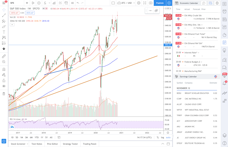
A professional that regularly interacts with visual data needs immediate access to it at all times. Having to perform extra actions to access vital features is both frustrating and unproductive. And here lies one of the most significant differences between consumer UX and enterprise UX (eUX).
Consumer UX is really passionate about sleek UIs, while enterprise software must ensure that users are able to do their work comfortably. Therefore, simplified, minimalistic interfaces aren’t really what enterprise UX designers are after.
Wizards are cool, but…
Onboarding your users is a vital step aimed at ensuring optimal user experience. However, while Wizards and guided tours are an excellent solution for casual users, it’s not necessarily the case for power users.
In both consumer and enterprise UX, designers must aim to develop products that require as little hand-holding as possible. However, simplistic product tours can be… well, simplistic. They often fail to uncover the entire functionality of a product, which is especially relevant for experienced users.
After running a series of tests, we found out that enterprise users tend to prefer to leave the app or platform for instructions. While this does seem somewhat disruptive to the experience of a product — it is understandable.
Off-page instructions can provide more in-depth explanations rather than the ones that are placed on the screen. Compare, for instance, a tool-tip and an article dedicated to a particular function.
Plan for non-linear flows
When it comes to designing enterprise UX&UIs, designers face a truly arduous task of creating complex, non-linear flows. These flows often involve a variety of roles, profile types, responsibilities, kinds of security, and much more. Our goal is to create a consistent and recognizable experience throughout all of these variables.
The complicated part, however, is not to force users into flows and scenarios. Experts and professional users need that freedom to make decisions and use the platform as they see fit.
Think of a person that is deeply versed in Microsoft Excel. They’ve been using this software for nearly a decade, and they know it like the back of their hand. More importantly, they have their style of working and solving problems. Limiting such users via linear and rigid flows could defeat the purpose of boosting their productivity.
Don’t fix it if it’s not broken
Innovation is a crucial element of UX design: enterprise or otherwise. We strive to continuously seek new and creative solutions to old problems. Often, we can even choose to be bold and put forth experimental solutions.
However, when it comes to enterprise UX, we have to be somewhat more conservative and experiment with caution. Enterprise software isn’t quite receptive to design solutions that go against the grain.
Since the central purpose of such software is to deliver quality work in short amounts of time, “reinventing the wheel” isn’t always a great idea.
When designing for enterprise, keeping an eye on your competition is even more relevant than in consumer software.
Let’s go back to Excel once more — imagine you’re trying to reinvent a complex, spreadsheet-based product. You’re looking to change the ways it represents data, or certain actions are performed. While this does sound like a laudable task, the critical question is — why?
In enterprise software design, the real value of a product is in its unique selling point that is translated via a design that looks familiar and intuitive.
That is not to say that the light of innovation never shines on enterprise products, but user expectations often trim the lengths we can go.
In conclusion
In order to reward you, our beloved reader, for making it till the end, we’ve designed a picture that summarizes the arguments in this article. We hope it will come in handy.
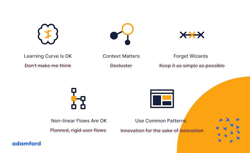
While the principles of “don’t make me think” will most likely outlive us, it’s crucial to outline the situations where they can be somewhat amended.
Enterprise user experience is a slightly more conservative field in terms of design, yet these limitations push us to become even more creative. By operating within these constraints, we have the power to make the future of work exciting and even more promising.


