

It was a cold April afternoon, still stuck in the office, I was slowly counting the hours to kick-off the spring break. With all the barbecues and get-togethers in my head, I got my mind wandering for a while when the phone rang. It was my mum trying to stutter out what just happened. My dad was taken to the hospital after he completely lost his sight and it turned out that both of his retinas got damaged.
Fortunately, after a long surgery doctors managed to partly save my dad's sight. We were both grateful and concerned about how he would find himself in the new reality.


The Ultimate Accessibility Checklist
Get a free copy of our accessibility checklist that features best practices, activities and tools to help ensure your product is accessible.
DownloadA couple of weeks after being discharged from the hospital he even tried to get back to work, but it turned out to be harder than we had initially expected. Surprisingly, all the pieces of software that he used at work were completely not adjustable to the people with visual impairments. To me as a product designer, it was unacceptable. Nevertheless, it got me thinking that awareness of the accessibility of digital products is still in its infancy and cannot be taken for granted. In addition, the pandemic and social distancing made me rethink the most critical question about the end-user (of any product I design), who has to swiftly adjust to the new reality and start using digital products he or she had never used before.
In this article I would like to convince you that your mindset shift towards inclusiveness (and accessibility) is not only about being empathetic, it’s about growing your business by making your product usable (or even enjoyable) for everyone despite cognitive, mental, or physical limitations.
Introduction
Over the last year, we’ve all experienced a digital evolution. Due to the pandemic, most of our everyday tasks and activities such as work, shopping, or even social events have been brought to an online environment. Although unexpected, this change has had a colossal impact on the awareness of inclusiveness and brought about an accessibility revolution.
Undoubtedly, social distancing made us (product people) rethink the most critical question about the end-user, who had to swiftly adjust to the new reality and start using digital products he or she had never used before.
What became apparent is that this mindset shift towards inclusiveness is not a temporary trend. Not anymore. It’s a new standard, which you have to keep up with in order to stay in the game.
This article is aimed at all the product/business people to help you realize that:
There is no such thing as an average user.
Not sticking to the accessibility standards may cost you a lot of money.
You can start on your own by following our guidelines and a few external tools which will support your efforts.
What accessibility really is? The definition.
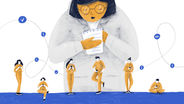
Although there is no single answer to this question, the essential message of an accessible design is to treat every user equally and give them the same opportunities regardless of their abilities. This simply means to apply your knowledge about disabilities in your design process, so your website or a product can be enjoyable and usable for everyone.
Sounds idealistic? Well, maybe to some extent, but in reality at least one billion, or 15% of the world’s population, experience some kind of disability.
What does it mean to your business? Practically speaking, if you don’t stick to accessibility standards you deliberately exclude up to 15% of your potential users by not taking into account their needs.
Let’s have a closer look at some numbers.
Learn from the mistakes of others
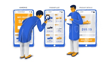
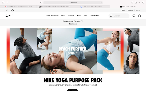
In 2017 Nike came under fine as both websites Nike.com and Converse.com were inaccessible to visually impaired users - the aforementioned websites we’re not usable with screen readers which means that visually impaired people were not able to use them and make any purchase without assistance. Apparently, Nike was not the exception, the list of companies that had to pay the price for the ignorance includes Netflix, Blue Apron, Domino’s Pizza, Fox News network.
Learn more about accessibility fails


Visual impairments? It’s just the tip of the iceberg. Quick overview of other types of disabilities.
When talking about digital products’ accessibility we often refer to visual impairments such as (color) blindness and low vision which affects about 17% of the global population. Nevertheless, the array of deficits and disabilities is much wider than you may think. What else should you take into consideration?


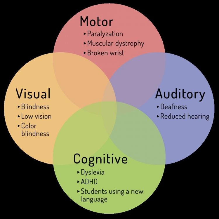
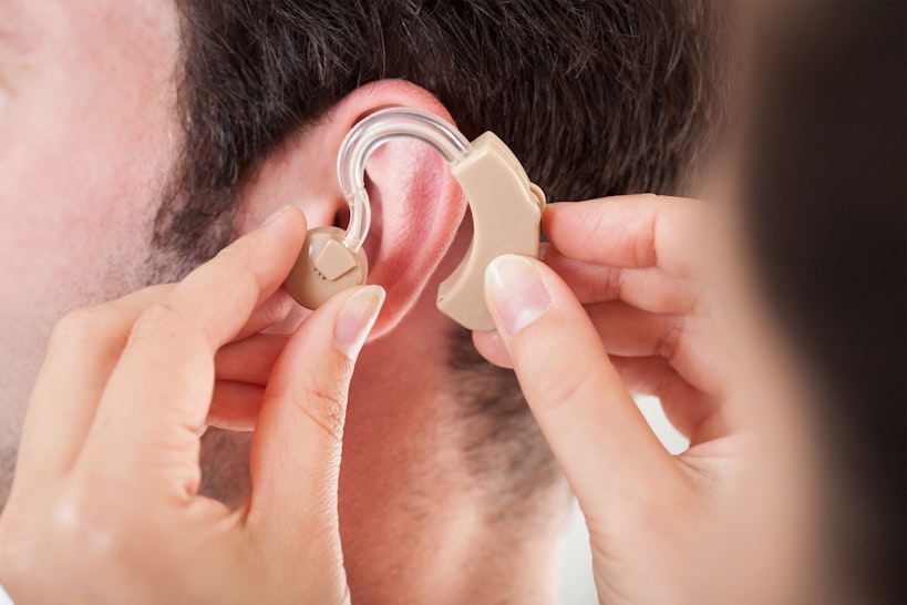
Auditory deficits (deafness, difficulty hearing)
466 million people (6% of the world’s population) have a disabling deafness and hearing loss.
By 2050, over 700 million people – or one in every ten people – are estimated to have disabling hearing loss.
Here are a few examples of products that should be especially mindful of users with auditory impairments: HBO, Netflix, Youtube, etc.


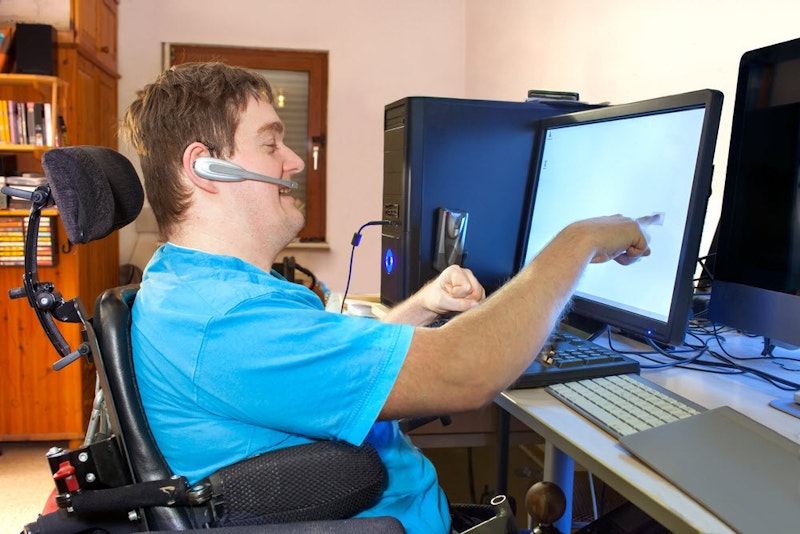
Motor / Mobility (wheelchair users, use of hands)
75 million (1% of the world’s population) people need a wheelchair on a daily basis.
There are more than 1 million annual limb amputations globally - one every 30 seconds.


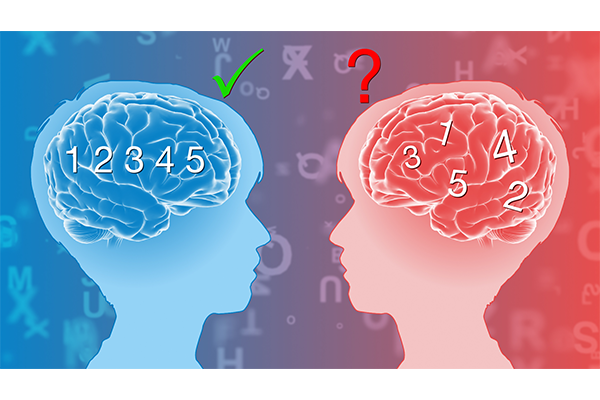
Cognitive impairments e.g. dyslexia, autism, dementia - perception, attention, memory, etc.
Intellectual disability: About 200 million people (2.6% of the world’s population) have an intellectual disability (IQ below 75).
Dyslexia - up to 20% of the world’s population could be struggling with dyslexia.
Epilepsy: Around 50 million people worldwide have epilepsy, making it one of the most common neurological diseases globally.
Autism: About one in 270 people have an ASD (Autism spectrum disorder).

Aging / Elderly people
According to World Population Prospects 2019 (United Nations, 2019), by 2050, 1 in 6 people in the world will be over the age of 65, up from 1 in 11 in 2019.
While being elderly isn't an impairment per se, it's a well-known design principle to simplify ruthlessly when dealing with these types of users. The older a person is, the less they are likely to adopt a lot of mental models about product design.


Speech and voice-related impairments
About 5% of children have noticeable speech disorders (stuttering, dysarthria, speech sound disorders, etc.) As for adults, about 1% of Americans stutter. These types of disorders should be especially taken into account by all kinds of voice-interface-based software.


Let’s cut to the chase - quick overview of best practices & do’s and don'ts
The below practices have been prepared based on the most critical WCAG 2.1 guidelines (conformance level AA recommended by W3C) as well as our own experience and knowledge about impairments.
Color contrast
Use high contrast between the background color and text. Requirements for WCAG 2.0 level AA contrast ratio are as following (visual imp, elderly):
For normal text: 4.5:1,
For large text (>14pt & bold): 3:1
For icons and user interface elements (e.g. form input border): 3:1
Source: WCAG 2.1: Contrast Minimum , WCAG 2.1: Non-text contrast
Check color contrasts on your website using: Color contrast checker


Typography
Use a sans serif typeface (such as Arial) as these font types are easier to decode (Dyslexia)
Text size should be between 14-16pt (Dyslexia, visual impairments, elderly people)
Italics should be avoided, as this makes words run together. Use bold for emphasis. Use left-justified text.
Decrease letter-spacing (~0.12*font size), increase word spacing(~0.15*font size). (Dyslexia, visual impairments)
Aim to have 60-70 characters per line. (Dyslexia, Autism, visual impairments)
Source: WCAG 2.1: Info and relationships, WCAG2.1: Text spacing
Use of colors
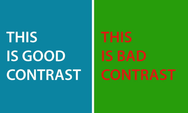
Avoid the following color combinations: red & green, yellow & blue, red & black (color blindness).
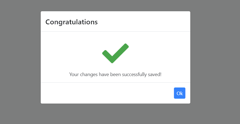
Make sure that information such as success, error messages, or links can be identified without relying on color only. Use a combination of text, graphic elements, and color. (Visual impair., Color blindness),


Source: WCAG 2.1: Use of color, WCAG 2.1: Sensory characteristics
Content
Make your message clear and straightforward, try not to include too many metaphors as they may not be understood by autistic people (Autism).
Use headings and images to break up blocks of text.
Try to use the active rather than the passive voice. (Intellectual, Autism)
Choose common words (for example, use “home” instead of “abode”).
Try to avoid complex sentences, keep your paragraphs short. (Autism, Dyslexia, Intellectual dis.)
Source: WCAG 2.1: Info and relationships
Links and buttons
Make your links & button labels meaningful, always include information about what happens next, e.g. “Read more about our company” instead of “Click here”.
This will help to prevent confusion by the meaning of the link and will make navigating on your website more efficient. (Cognitive, motion, visual)
Media
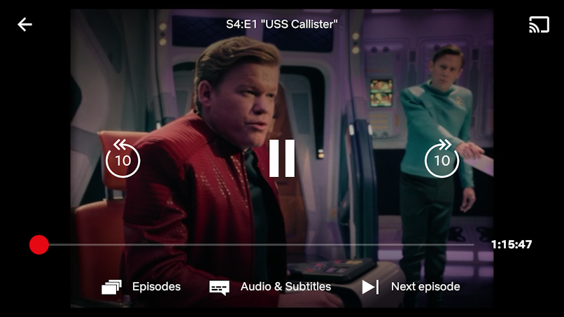
Include text alternatives such as audio or video - make sure they are not set on autoplay! (Dyslexia, visual)
Give users control: play, pause, speed adjustments.
Offer a transcription to audio and video content. (Hearing)
Source: WCAG 2.1: Non-text content, WCAG 2.1: Pause, stop, hide , WCAG 2.1: Time Adjustable


Graphic elements
Icons can be very useful in providing complementary visual information for elements on your website (Autism, Visual).
Images that are used for decorative purposes should not be announced by a screen reader.
Source: WCAG 2.1: Non-text content
Time and motion
Avoid carousels, quickly changing content. Give users time to decode information. (Dyslexia, Epilepsy, Elderly people)
Avoid flashy, unexpected animations - (No more than 3 seconds unless the content is small or low contrast) (Seizures, Epilepsy, Autism, Elderly people)
Source: WCAG 2.1: Seizures and physical reactions , WCAG 2.1: Three flashes or below threshold , WCAG 2.1: Three flashes
Technical aspects
Links, buttons should always have an accessible description (via tags) and inputs associated labels to be identified by a screen reader.
Assign an ARIA required or not required role to each field (know how to use ARIA). Avoid the asterisk convention.
Use proper HTML elements in lists. Don’t put them on the same line as the text.
Validate the markup to make sure that all browsers can read your code.
Make your website usable with a keyboard only! Some users may not be able to use a mouse.


Page structure
Use informative headings and relevant content. Don’t forget about input labels.
This can help users to quickly decode information users are interested in and will prevent errors caused by improper fields’ completion. (limited short-term memory, low vision, dyslexia etc.)
Source: WCAG 2.1: Headings and labels , WCAG 2.1: Section headings,
Navigation
Make your site navigation is intuitive and logical and do not rely on a search tool only.
Make sure all navigation elements have the same order on all the pages. It will help users to predict where they can find certain information on each page. (Cognitive, low vision, intellectual)
Source: WCAG 2.1: Consistent Navigation
Conclusion
By all means, complying with accessibility standards and creating its awareness requires extra time and effort. The good news is that it will definitely pay off. Improving accessibility means enhancing the overall user experience which will put you ahead of the curve because of the following reasons:
Increase a group of potential users/customers by up to 15%. By getting more users onboard you automatically increase your revenue.
Positive impact on SEO. Better usability for a larger group of people automatically results in better engagement metrics. The latter is among the most important ranking factors. Learn more about the impact on SEO
Great PR and brand image –your company is a lot more likely to be perceived as trustworthy and empathetic which is of paramount importance for your company’s reputation.
Improve overall user experience – a more accessible product means a more user-friendly product to all of your users.
Don’t put accessibility on the back burner! You can really kick off on your own by using Chrome extensions such as WAVE to spot the most critical issues and continue with hiring a dedicated agency to do an accessibility audit for you. Nevertheless, fully embracing the topic of accessibility would require the involvement of users. Since without them we’ll never be able to design the product they love.